I Aced the Stroop Test
I Aced the Stroop Test (and My Theory About Why)
A friend recently dropped a Stroop test quiz in my messages. You know the one—color words printed in mismatched ink, and your job is to name the ink color while ignoring what the word actually says. I breezed through it. No hesitation, no second-guessing, just a smooth run of “blue… green… red…” while the words themselves tried (and failed) to hijack my mouth.
It got me thinking. I’ve always been a visual person—graphic design, web work, the whole creative thing for decades. My theory is that people wired like me might find the color-naming part easier than most, precisely because we’re more attuned to the visual than the verbal. Reading the word is automatic for almost everyone; naming the color requires effort. But if your brain already prioritizes what it sees, maybe the interference is quieter. I don’t know how solid that is, but it felt true in the moment.
What the test actually is
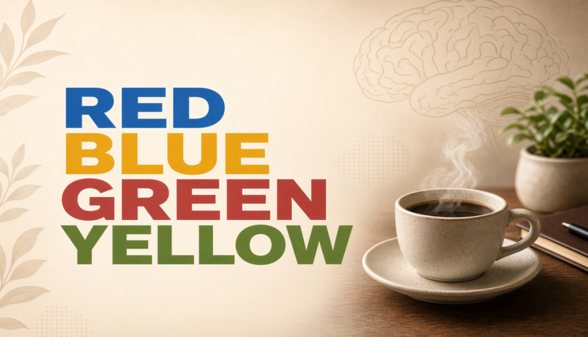
The classic version shows words like “RED,” “BLUE,” or “GREEN” printed in the wrong ink color. Your task is to say the color of the ink, not the word. When they match (the word “red” in red ink), it’s easy. When they clash (the word “red” in blue ink), most people slow down and stumble. That delay is the Stroop effect—the brain’s automatic reading habit colliding with the slower, more deliberate job of identifying color.
There’s also usually a neutral condition (colored patches or non-color words) so researchers can measure how much extra time the conflict costs you. The bigger the gap, the stronger the interference.
Where it came from
John Ridley Stroop published the work in 1935 in the Journal of Experimental Psychology under the title “Studies of interference in serial verbal reactions.” It was based on his dissertation at George Peabody College. He wasn’t the absolute first person to notice the idea—earlier researchers like James McKeen Cattell had looked at naming vs. reading speed, and someone in Germany had published something similar in 1929—but Stroop was the one who put the conflicting word and color on the same stimulus and measured the clash cleanly.
Interestingly, the paper sat relatively quiet for years. It only became a staple of psychology textbooks and research labs decades later, once people realized how useful it was for studying attention and automatic processes. Stroop himself largely moved on to teaching and other interests.
Why it still matters
The test is a quick, robust way to look at executive function—specifically inhibitory control (can you stop yourself from saying the automatic word?), selective attention, and cognitive flexibility. Because reading is so practiced and automatic, the task forces your brain to override a strong habit in real time.
Clinically, variations of it show up in assessments related to ADHD, frontal lobe function, cognitive changes with aging, and other conditions where the ability to filter irrelevant information or switch focus matters.
Researchers also use it in brain imaging studies to watch areas like the anterior cingulate cortex and dorsolateral prefrontal cortex light up when conflict has to be resolved.
It’s not a perfect or complete measure of “how smart” someone is, but it’s remarkably consistent and sensitive to how well someone can manage competing information.
Back to my theory
I aced the color-naming version with almost no lag. My hunch is that for visual/creative people, the color itself is more salient—more “real”—than the word. The visual system is already in the driver’s seat, so suppressing the word takes less effort. There’s actually a 2014 study (Edl and colleagues) that found design students showed essentially no Stroop interference effect and performed faster overall compared with a control group, and that stronger control related to measures of originality and fluency. That lines up with what I felt, though the broader research on creativity and cognitive control is mixed—some studies find creative people better at inhibiting, others find advantages from more open or less filtered attention depending on the task. So I’m not declaring a universal rule. It’s just one person’s experience plus a plausible mechanism.
If you’re the kind of person who thinks in images, layouts, or color first, try the test yourself and see what happens. Does the color jump out, or does the word still win? I’d love to hear how it goes for other creative types.
Either way, it’s a neat little window into how automatic our habits are and how much work our brains do behind the scenes to keep us on track. Mine, apparently, just prefers the paint over the label.